Walk into any university, government building, or traditional institution and you will likely find an emblem on the wall. Look at the badge on a car, the crest on a sports team’s jersey, or the seal on an official document, and you are looking at emblem logos. They are one of the oldest logo formats in existence and still one of the most widely used.
This guide explains what an emblem logo is, the different types that exist, what makes them work, and when they are the right choice for a brand.
What Is an Emblem Logo?
The Definition
Text Inside a Shape
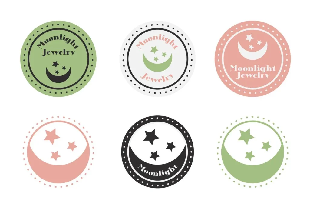
An emblem logo is a logo design in which text and imagery are contained within a unified shape or boundary. Unlike combination marks where a symbol and a wordmark exist as separate elements that are placed together, an emblem integrates text and visual elements into a single inseparable unit. The text is not placed beside the image. It is part of the same enclosed design.
This integration gives emblem logos their characteristic quality: they look like a single, unified mark rather than a composition of separate parts. The result is a compact, authoritative visual that communicates tradition, institution, and established credibility.
Emblem Logo vs. Other Logo Types
The confusion between emblem logos and other formats, particularly combination marks and badges, is worth clearing up. Understanding how emblem logos differ from formats such as wordmark logos can help brands choose a logo structure that best reflects their identity and long-term goals. A combination mark has a wordmark and a symbol that can be used separately. An emblem logo cannot be separated into parts without destroying the design. The text inside an emblem cannot function on its own the way a wordmark can. The symbol inside an emblem is not designed to stand alone the way a pictorial mark is.
Types of Emblem Logos
| Emblem Type | Description | Typical Use Cases |
| Classic seal emblem | Circular or oval shape with text around the perimeter and imagery in the center | Universities, government bodies, legal institutions |
| Badge emblem | Shield or badge shape containing text and imagery | Sports teams, automotive brands, craft producers |
| Crest emblem | Heraldic-inspired design featuring shield, banner, and decorative elements | Heritage brands, sports clubs, prestige institutions |
| Stamp or label emblem | Vintage-inspired circular or rectangular shape resembling a product stamp | Craft beverages, artisan food brands, heritage products |
| Modern geometric emblem | Clean geometric container shape with minimal text and simplified iconography. These simplified approaches often reflect broader logo design trends that prioritize clarity and versatility across digital platforms. | Contemporary professional services, tech companies with traditional positioning |
The Meaning Behind Emblem Logo Design
What Emblem Logos Communicate
Authority and Institutional Credibility
The historical association of emblems with institutions of authority, from royal seals to university crests to government stamps, gives emblem logos an inherent credibility signal that other logo formats do not carry in the same way. When a brand uses an emblem logo, it is borrowing from that accumulated association. The design says: we have been here, we have standards, and we stand behind what we produce.
Heritage and Tradition
Emblem logos communicate longevity even when a brand is young. This is why new businesses in sectors where heritage matters, craft brewing, artisan food production, professional services, educational institutions, often choose emblem formats. The design signals that the brand values what has been built over time rather than what is trending now.
Quality and Craft
The complexity that many emblem logos carry, the multiple design elements, the careful typography, the detailed imagery, signals investment and care. A simple wordmark communicates modernity and efficiency. An emblem communicates that someone spent time on this and that the product or service behind it reflects the same attention to detail.
Well-Known Emblem Logo Examples
Brands That Use the Format
Automotive Brands
Many of the world’s most recognized automotive logos are emblems. BMW’s circular divided roundel, Mercedes-Benz’s three-pointed star enclosed in a circle, and Volkswagen’s VW in a circle are all emblem logos that integrate a symbol or letterform within a contained shape. In the automotive category, emblem logos communicate engineering heritage, precision, and premium quality. These associations have held across decades of use.
Sports Teams
Professional sports teams across most major leagues use emblem logos as their primary marks. The shield or crest format is particularly common in football, soccer, and rugby, where heraldic imagery carries specific cultural associations with territory, competition, and loyalty. The badge emblem in sports communicates belonging and identity in a way that a clean wordmark or abstract symbol cannot match.
Universities and Institutions
Almost every university seal and institutional crest follows the emblem format: a defined boundary shape, typically circular, containing the institution’s name, founding date, motto, and representative imagery. The format communicates academic tradition, intellectual authority, and institutional stability. These are among the most unchanged logos in existence because their value is tied specifically to their continuity.
Craft and Artisan Brands
The stamp and label style of emblem logo has become widely used by craft beverage producers, artisan food brands, and small-batch manufacturers. These brands use emblem formats to communicate that their products are made with care and attention to craft rather than produced at industrial scale. The vintage-inspired emblem design signals authenticity and deliberate production in markets where those qualities command premium pricing.
When to Choose an Emblem Logo
Is It Right for Your Brand?
Strong Candidates for Emblem Logos
- Businesses where heritage, tradition, or institutional authority are core brand values
- Professional services firms where credibility and established reputation matter to clients
- Educational institutions, associations, and organizations that benefit from a seal or crest format
- Sports teams and clubs where identity and belonging are central to the brand relationship
- Craft producers, artisan businesses, and premium food and beverage brands
- Brands that will use their logo primarily on physical products, uniforms, or physical materials
When Emblem Logos Create Problems
Emblem logos have real limitations. They are often difficult to reproduce clearly at very small sizes because the internal detail and text become illegible. This is a significant constraint in an era where logos must function as app icons, social media profile images, and favicon sizes. Many brands that use emblem logos as their primary mark also develop simplified secondary marks, often just the central icon without the surrounding text, for small-scale digital use.
Designing an Effective Emblem Logo

Key Design Principles
Legibility at Every Intended Size
The most common failure in emblem logo design is including text and detail that becomes illegible at the sizes the mark will actually be used. Before finalizing an emblem design, test it at the smallest size it will appear in any application. If the text in the perimeter is unreadable or the central imagery is indistinct, the design needs simplification. Creating scalable artwork is critical, which is why professional designers typically build logos as vector logos that maintain clarity at any size.
Proportional Balance
An emblem logo is a contained world. Everything within the boundary shape must feel balanced and proportional. Text too large for the shape crowds the imagery. Imagery too detailed for the scale overwhelms the text. The negative space within the boundary, the breathing room around elements, is as important as the elements themselves.
Choosing the Right Container Shape
The boundary shape of an emblem is not decorative. It is communicative. Circles suggest continuity, community, and completeness. Shields suggest protection, competition, and heritage. Rectangles and stamps suggest product and craft. Ovals suggest premium and traditional authority. The shape choice should match the associations you want the brand to carry.
Final Thoughts
An emblem logo is one of the oldest and most loaded visual formats available to brand designers. When it is right for a brand, it communicates authority, tradition, and quality with an efficiency that more modern logo formats cannot replicate. When it is not right for a brand, it can feel dated, heavy, or mismatched with the brand’s actual character.
The decision to use an emblem logo should be grounded in whether the associations it carries align with what the brand genuinely wants to say about itself.
Logo Cosmic designs brand identities across every format, including emblems, wordmarks, and monogram logos. If you are deciding on the right format for your brand, reach out to us and we will help you figure it out.
FAQs
1. What is an emblem logo?
An emblem logo is a design in which text and imagery are contained within a unified shape or boundary as a single inseparable unit. Unlike combination marks where elements can be used separately, the text and imagery in an emblem logo are integrated into one enclosed design.
2. What is the difference between an emblem logo and a badge logo?
A badge logo is a specific type of emblem logo that uses a shield or badge shape. All badge logos are emblems, but not all emblems are badges. Emblem logos include other boundary shapes such as circles (seals), ovals, stamps, and geometric forms.
3. What brands use emblem logos?
Well-known examples include BMW, Mercedes-Benz, Volkswagen (automotive), most professional sports teams, virtually all university and institutional seals, and many craft beverage and artisan food brands. The format is also common in government, legal, and professional services branding.
4. What are the disadvantages of emblem logos?
Emblem logos can be difficult to reproduce legibly at very small sizes because the internal text and detail become unclear. Many brands that use emblems as their primary mark also develop simplified secondary marks for small-scale digital applications like app icons and favicons.
5. When should a brand choose an emblem logo?
Emblem logos work best for brands where heritage, institutional authority, craft, or community belonging are core values. They suit professional services, educational institutions, sports teams, craft producers, and any brand that will use its logo primarily on physical products or materials where the full emblem can be reproduced clearly.