Some of the most recognized brand identities in the world are nothing more than a name, carefully designed. Google. FedEx. Coca-Cola. NASA. These companies have built global recognition around a wordmark logo, a design that relies entirely on the brand name itself rather than a symbol, icon, or illustration.
Understanding what a wordmark logo is, why companies choose it, and when it works best helps you make a more informed decision when developing your own visual identity.
What Is a Wordmark Logo?
The Definition
Just the Name, Done Well
A wordmark logo is a logo that consists solely of the brand name, rendered in a distinctive typeface with careful attention to spacing, weight, and finish. Understanding foundational concepts such as what a vector logo is is equally important when creating a scalable and professional brand identity.
There is no accompanying symbol, icon, or graphic element. The entire identity lives in the typography.
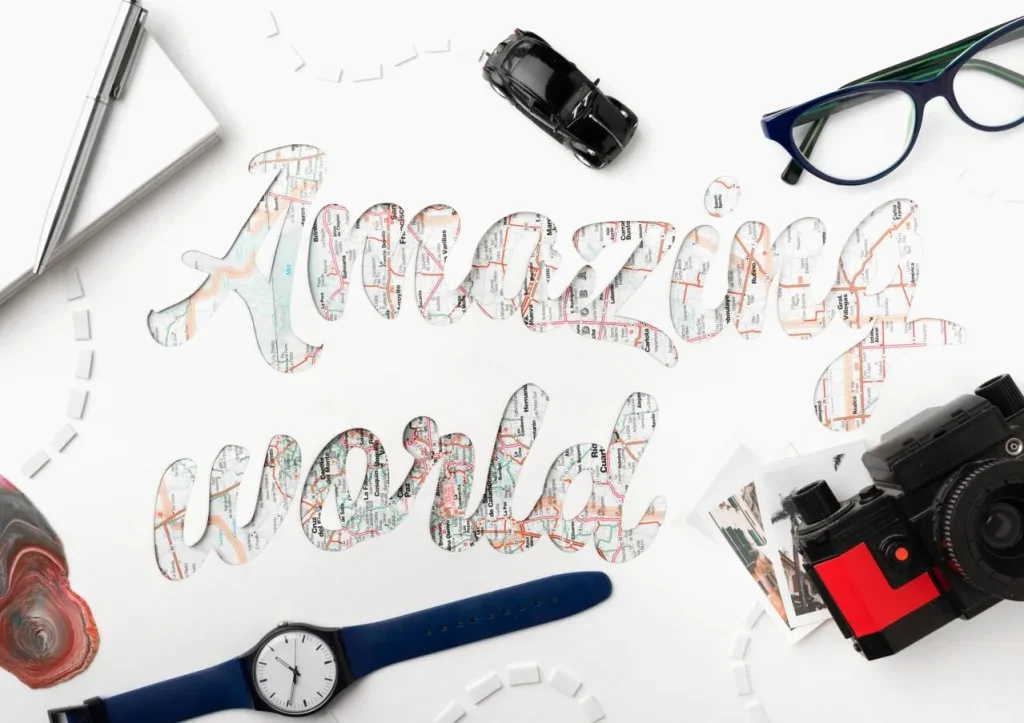
What makes a wordmark logo different from simply typing your company name is the level of craft applied to it. Similar to monogram logo design, successful wordmarks rely on thoughtful typography and customization rather than generic fonts.The typeface choice, the custom letterform adjustments, the spacing decisions, and the color selection all work together to make the name feel like a deliberate, ownable brand mark rather than text on a page.
Wordmark vs. Related Logo Types
| Logo Type | What It Is | Example Brands |
|---|---|---|
| Wordmark | Brand name only, custom typography | Google, Coca-Cola, FedEx, Sony |
| Lettermark | Initials only, no full name | IBM, NASA, HBO |
| Pictorial mark | Symbol or icon only, no text | Apple (standalone), Twitter bird |
| Combination mark | Symbol plus wordmark together | Nike (swoosh + name), Burger King |
| Emblem | Text integrated within a shape or badge | Starbucks (early versions), Harley-Davidson |
Benefits of a Wordmark Logo
Why Companies Choose This Format
Name Recognition Builds Faster
When your logo is your name, every impression of the logo is also an impression of the name. There is no mental translation required between a symbol and a brand. For newer companies trying to build recognition in competitive markets, a wordmark logo accelerates name recall because the name and the visual mark are the same thing.
Extraordinary Versatility
A well-designed wordmark logo works across every application: business cards, websites, product packaging, signage, embroidery, vehicle wraps, and brand merchandise. Because it contains no illustration or complex graphic elements, it scales cleanly to any size and reproduces clearly in any format, from a favicon to a billboard.
Simplicity That Ages Well
Logos built on complex illustrations or heavily trend-influenced typography tend to date quickly. Keeping an eye on current logo design trends can be useful, but timeless typography often delivers greater long-term value. A wordmark built on considered, well-crafted typography often ages better because it is built on fundamentals rather than current aesthetics. The Coca-Cola wordmark has not changed substantially in decades. Its longevity is a function of its typographic foundation.
Budget-Friendly to Execute
Wordmark logos are often less expensive to design than combination marks or illustrated logos because they require focused typographic work rather than extensive illustration. They also cost less to reproduce across different applications because a clean typographic mark adapts easily without redrawing.
When a Wordmark Logo Works Best
Matching the Format to the Business
When the Name Is Strong and Distinctive
A wordmark works best when the brand name itself is memorable, relatively short, and distinctive. A name that is difficult to pronounce, very long, or generic is harder to carry as a wordmark. Names like Google, Sony, or Vogue work as wordmarks partly because the names themselves are distinctive and easy to remember after a single encounter.
When Multiple Languages or Scripts Are Not Required
Wordmark logos become complicated when a brand needs to function across multiple language scripts. If your brand will operate in markets using different writing systems, a symbol or icon may serve better as the primary international mark, with the wordmark used in local language versions.
When You Are Starting Out and Building Name Recognition
For a new business, getting the name into every visual impression is strategically valuable. A wordmark logo ensures that every time someone sees your brand, they see and read your name. Early-stage businesses that go straight to an icon-only or abstract symbol mark often find that the symbol does not carry enough accumulated recognition to work independently.
What Makes a Wordmark Logo Work
The Design Elements That Matter
Typeface Selection
The typeface is the wordmark. It is the most significant creative decision in the entire design process. The typeface communicates the brand’s personality before the reader even processes the name. A clean geometric sans-serif communicates differently from a refined serif, which communicates differently from a custom script. Choosing the right typeface for your brand positioning is not a shortcut decision. The same strategic thinking applies when learning how to design a monogram logo, where typography becomes a central part of the brand identity.
Custom Letter Adjustments
Most professional wordmark logos are not simply a brand name set in an existing font and called finished. Designers adjust individual letters, modify spacing optically rather than mechanically, and sometimes draw entirely new characters to give the mark a distinctive quality that cannot be reproduced by someone simply typing the name in the same font.
Spacing and Weight
The space between letters, called tracking or kerning, and the weight of the typeface both affect how the wordmark reads and feels. Letters set too tightly feel cramped. Too loosely set, they feel disconnected. Getting the spacing right is one of the most time-consuming and most important parts of wordmark design.
Real-World Wordmark Examples and What They Communicate
| Brand | Typeface Style | What It Communicates |
|---|---|---|
| Custom rounded sans-serif, multicolor | Approachable, playful, accessible to everyone | |
| Coca-Cola | Custom flowing script | Heritage, warmth, timelessness |
| FedEx | Bold clean sans-serif with hidden arrow | Speed, precision, forward movement |
| Sony | Clean geometric uppercase | Modern, reliable, global technology |
| Vogue | Condensed serif with strong presence | Authority, fashion, high standards |
| Disney | Custom flowing script | Magic, warmth, childhood joy |
Final Thoughts
A wordmark logo is not the simplest logo type to design well, but it is one of the most powerful when it works. The entire identity lives in the typography, which means there is no illustration to carry the weight and no symbol to create visual interest. The name has to do all of that work through craft alone.
When a wordmark is well-executed, the result is a brand mark that is instantly legible, extremely versatile, and built to last. That combination of qualities is why so many of the most recognized brands in the world have chosen it.
Logo Cosmic designs wordmark logos built on typographic craft and brand strategy. If you are developing your visual identity and want to explore whether a wordmark is the right choice for your brand, reach out to us. We are happy to take a look at what you are building.
FAQs
1. What is a wordmark logo?
A wordmark logo is a logo that consists of the brand name only, designed in a distinctive custom typeface without any accompanying symbol or icon. The entire identity lives in the typography itself.
2. What is the difference between a wordmark and a lettermark?
A wordmark uses the full brand name. A lettermark uses only the initials. IBM and NASA are lettermarks. Google and Coca-Cola are wordmarks. Both are text-based logo formats, but they work differently in terms of name recognition.
3. When should a company use a wordmark logo?
A wordmark works best when the brand name is short, distinctive, and memorable, when the company is building name recognition from scratch, and when the brand will operate primarily in markets using a single writing script.
4. Are wordmark logos cheaper to design than other logo types?
They are often less expensive than illustrated or combination mark logos because they do not require complex illustration work. However, a well-crafted wordmark still requires skilled typographic judgment and custom letter adjustments that take real design time.
5. Can a wordmark logo be trademarked?
Yes. Wordmark logos can be trademarked as long as they are sufficiently distinctive. A wordmark in a custom or heavily modified typeface has stronger trademark potential than one set in a widely available standard font with no modifications.