Walk through any luxury retail district in the world and the same visual pattern emerges: two or three interlocked letters, rendered with precision, carrying an entire brand identity in a minimal footprint. These are monogram logos, and their prevalence at the premium end of almost every consumer category is not coincidental.
Understanding what a monogram logo is, why it has endured as a design format across centuries and cultures, and why it continues to attract businesses of every size in 2026 reveals something important about how brand identity actually works. This guide covers all of it.
What Is a Monogram Logo?
The Definition
Initials as Identity
A monogram logo is a visual mark created by combining two or more letters, typically the initials of a brand or individual name, into a single unified design. The letters may be stacked, interlocked, overlapping, or arranged in a custom configuration, but they always function as a single cohesive mark rather than individual separate characters.
The monogram logo is one of the oldest forms of personal and organizational identification. Royal households, craftspeople, and religious institutions have used monograms as identifying marks for thousands of years. In contemporary branding, the format has been adopted by businesses ranging from fashion houses and luxury hotels to law firms, design studios, and personal brands.
Monogram Logo vs. Lettermark vs. Wordmark
These three logo formats are related but distinct. A monogram logo combines initials into a unified mark, often with design interaction between the letters. A lettermark uses initials set in a typeface without necessarily combining them into a single mark. A wordmark spells out the full brand name. The monogram is specifically characterized by the visual integration of the letters into a single design unit.
Types of Monogram Logos
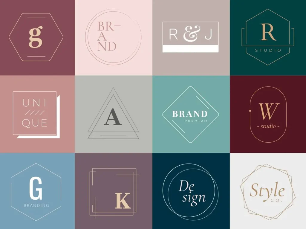
| Type | Description | Typical Use |
| Interlocked monogram | Letters woven through each other creating shared negative space | Fashion, luxury goods, heritage brands |
| Stacked monogram | Letters arranged vertically one above the other | Formal businesses, professional services, law firms |
| Single letter mark | One dominant initial functioning as the complete brand symbol | Personal brands, agencies, minimalist brands |
| Circular monogram | Letters arranged within or around a circular frame | Institutions, seals, traditional or conservative brands |
| Letterform monogram | Letters redesigned into a new unified abstract shape | Tech companies, modern brands, design-forward businesses |
| Overlapping monogram | Letters placed over each other with transparency or blending | Creative industries, lifestyle brands, contemporary design |
Why Monogram Logos Are So Popular
The Practical Advantages
Versatility Across Applications
One of the primary reasons monogram logos remain popular across industries and eras is their extraordinary versatility. A well-designed monogram works at the size of a favicon, embossed on a leather wallet, embroidered on a garment, engraved on hardware, printed on stationery, and displayed on a building facade. Few other logo formats maintain their integrity and legibility across such a wide range of scales and materials.
The Solution to Long Brand Names
A significant practical driver of monogram logo popularity is the challenge of rendering long brand names visually. A law firm with four partners, a design agency with a compound name, or a luxury brand with a hyphenated or multi-word identity all benefit from a monogram that distills the brand to its essential identifying mark. What is a monogram logo in these contexts? It is the practical solution to a naming and visual identity challenge.
The Perception Advantages
Communicating Premium Positioning
Monogram logos carry an inherent association with quality, craftsmanship, and exclusivity that has been built over centuries of use by the world’s most prestigious brands. The Louis Vuitton LV, the Chanel interlocked Cs, the Gucci double-G: these marks have trained consumer perception to associate the monogram format with premium positioning. For brands that want to communicate quality without using overtly luxurious language, adopting a well-executed monogram logo borrows from that accumulated perception.
Personal Identity and Authorship
Monogram logos are particularly powerful for personal brands, sole proprietors, and creative professionals because they embed the individual’s identity directly into the visual mark. An architect, a photographer, a consultant, or a designer whose initials form a compelling monogram creates an immediate and memorable personal identifier that connects their work directly to their name.
The Aesthetic Advantages
Timelessness Through Restraint
Design trends cycle constantly. What looks contemporary today often looks dated within a few years. Monogram logos, when well-executed, resist this cycle because their visual logic is based on typographic precision and structural integrity rather than trend-driven aesthetic choices. The most enduring monogram logos in use today were designed decades ago and remain as relevant now as when they were created. This longevity is a genuine commercial advantage for businesses making long-term brand investments.
The Negative Space Opportunity
A well-designed monogram creates interesting and intentional negative space, the area between and around the letters, that adds visual depth and sophistication to the mark. The best monogram logos contain visual discoveries: unexpected shapes formed by the interaction of the letterforms that reward closer inspection. This quality is what separates genuinely excellent monogram design from competent but unremarkable execution.
Industries and Contexts Where Monogram Logos Excel
Fashion and Luxury
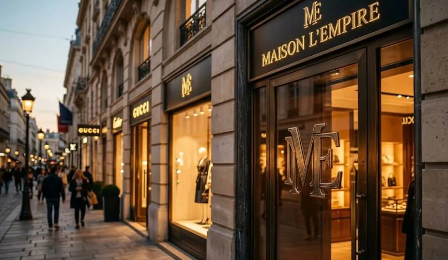
The Dominant Format for Premium Brands
Fashion and luxury brands have made the monogram logo a category standard because it solves multiple branding challenges simultaneously. It provides a mark that works on product hardware such as buttons, clasps, and zipper pulls, as an embossed or embroidered garment label, as a repeated pattern on fabric, and as a hero mark on packaging, retail environments, and digital presence. No other logo format provides this range of functional versatility within the luxury context.
Professional Services
Authority Without Complexity
Law firms, financial advisors, consultants, and professional services organizations often choose monogram logos because they communicate authority, precision, and seriousness without the visual complexity or potential inconsistency of illustrative marks. A clean, well-spaced monogram in a quality serif typeface communicates the same values as a firm’s name without requiring the full name to appear at every scale.
Hospitality and Hotels
The Monogram as a Mark of Welcome
Luxury hotels and hospitality brands have long used monogram logos for the same reasons as fashion houses: extraordinary application versatility across stationery, linens, uniforms, signage, key cards, and digital platforms. The monogram creates a consistent identifying mark that functions elegantly across all of these touchpoints without becoming visually overwhelming.
What Makes a Monogram Logo Work
The Essential Design Qualities
Typographic Precision
The quality of a monogram logo is determined primarily by the quality of the typography. Letter selection, typeface choice, weight, spacing, and the relationship between individual letterforms all contribute to whether the final mark feels considered and refined or assembled and generic. The best monogram logos are built on exceptional typographic foundations.
Legibility at Every Scale
A monogram logo must remain legible at the smallest size it will be used. Interlocking and overlapping designs that look sophisticated at large sizes often become muddy and illegible at small sizes. Testing the mark at favicon size, at label size, and at embroidery size before finalizing is essential to ensuring the design works in real-world applications.
Final Thoughts
The monogram logo endures because it solves real problems elegantly. It compresses identity into a minimal form. It works across an extraordinary range of applications and scales. It carries associations with quality and craftsmanship built over centuries of use. And when executed with genuine typographic skill, it creates a mark that ages well and rewards long-term investment.
For businesses wondering what is a monogram logo and whether it is right for them, the answer often depends on whether the initials create a compelling visual combination and whether the brand positioning benefits from the format’s inherent associations.
Logo Cosmic specializes in creating monogram logos and brand identities built on strategic thinking and typographic craft. If you are exploring whether a monogram logo is right for your brand, reach out to us today and let us explore the possibilities together.
FAQs
1. What is a monogram logo?
A monogram logo is a visual mark created by combining two or more letters, typically initials, into a single unified design. The letters may be stacked, interlocked, overlapping, or arranged in a custom configuration that functions as one cohesive brand mark.
2. Why are monogram logos so popular in luxury branding?
Monogram logos offer extraordinary application versatility across product hardware, garments, packaging, and digital platforms. They also carry centuries of association with craftsmanship and exclusivity, and their minimal format communicates confidence and premium positioning without visual complexity.
3. What is the difference between a monogram logo and a lettermark?
A monogram logo specifically involves visual integration of the letters into a single unified mark, often with interlocking, overlapping, or combined forms. A lettermark uses initials set in a typeface but does not necessarily combine them into a single design unit.
4. What industries use monogram logos most effectively?
Fashion and luxury goods, professional services including law and finance, hospitality and hotels, personal brands and creative professionals, and design-forward businesses across many categories all use monogram logos effectively. The format works wherever brand authority, quality, and application versatility are priorities.
5. How do you make a monogram logo work at small sizes?
Test the design at the smallest size it will be used, including favicon size and embroidery or label size, before finalizing. Interlocking designs that look sophisticated at large sizes often become illegible at small sizes. Simplify the design until it remains clear and recognizable at every scale.