Some of the most recognized brand identities in the world are nothing more than two or three letters. IBM. HBO. NASA. CNN. These companies built global recognition around a lettermark logo, a design that uses initials rather than a full name or a symbol. The format is deceptively simple and, when executed well, one of the most durable and scalable logo types available.
This guide covers what a lettermark logo is, how it differs from related formats, when it makes sense to use one, and what distinguishes a good lettermark from a forgettable one.
What Is a Lettermark Logo?
The Definition
Initials as a Brand Mark
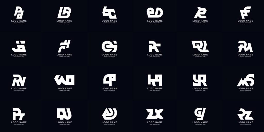
A lettermark logo is a type of logo that consists of letters only, typically the initials of an organization or brand name, designed and styled to function as a distinctive visual mark. The letters are set in a specific typeface, sometimes custom-modified, and presented without accompanying imagery, symbols, or the full brand name. The lettermark itself is the logo.
The key requirement for a lettermark to work is that the initials are recognizable as belonging to a specific brand without additional context. IBM does not need to spell out International Business Machines for the three letters to carry full brand authority. That recognition is built through consistent use over time, not an inherent property of the letters themselves.
Lettermark vs. Related Logo Types
How to Tell Them Apart
| Logo Type | What It Uses | Example Brands | Key Characteristic |
| Lettermark | Initials only (2 to 4 letters) | IBM, HBO, NASA, CNN | Full brand name abbreviated to initials |
| Wordmark | Full brand name in custom typography | Google, Coca-Cola, FedEx | Complete name is the logo |
| Monogram | Initials combined into a single unified mark | Louis Vuitton LV, Chanel CC | Letters integrated or overlapping as one shape |
| Pictorial mark | A symbol or icon, no text | Apple (standalone), Twitter bird | Image represents brand with no letterforms |
| Combination mark | Symbol plus wordmark or lettermark together | Nike full logo, Burger King | Both image and text present as separate elements |
Why Companies Choose Lettermark Logos
The Practical Advantages
Long Names That Do Not Work as Wordmarks
The most common driver for choosing a lettermark over a wordmark is a company name that is simply too long to function as a visual brand mark. International Business Machines does not work as a wordmark. IBM does. Federal Bureau of Investigation becomes FBI. National Aeronautics and Space Administration becomes NASA. When a full name cannot be rendered at small sizes or on physical objects without becoming illegible, a lettermark solves the problem by creating a usable, scalable mark from the initials.
Professional and Institutional Authority
Lettermarks carry an inherent association with institutional authority, expertise, and established credibility. This association comes from the longstanding use of the format by government agencies, broadcasting networks, financial institutions, and major corporations. When a brand uses a lettermark, it borrows from these associations. The format signals that the organization is established enough to be known by its initials rather than needing to spell out its full name.
Versatility Across Applications
A well-designed lettermark works cleanly at any size: favicon, business card, letterhead, billboard, vehicle signage, or embroidered uniform badge. Because it contains no illustration or complex graphic elements, it scales without loss of legibility and reproduces cleanly in any format. This versatility is particularly valuable for organizations that operate across many different physical and digital contexts.
What Makes a Lettermark Logo Work
The Design Principles That Matter
Typeface Selection Is Everything
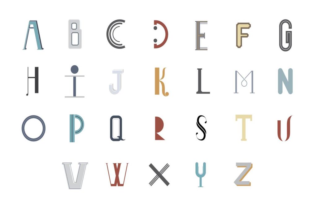
In a lettermark, the typeface is the logo. There is no symbol to carry visual interest, no illustration to add personality, and no full name to provide context. Everything depends on how the letters look and what they communicate. A serif typeface conveys tradition and authority. A geometric sans-serif conveys modernity and efficiency. A custom or heavily modified typeface creates uniqueness and reduces the risk of the logo looking like a generic text treatment.
Spacing and Proportion
The space between letters in a lettermark, called tracking or kerning, and the proportional relationships between letters determine whether the mark feels considered and refined or assembled and generic. Letters set too tightly feel cramped. Too loosely set, they feel disconnected. The right spacing is determined optically, based on what looks right, not mechanically, based on equal pixel distances.
Color and Weight
Letter weight (how thick or thin the letterforms are) and color together establish the personality and authority of the mark. Heavy weight letters in deep blue or black convey strength and authority. Thin letterforms in a mid-weight color convey precision and refinement. The wrong combination of weight and color can undermine an otherwise well-designed lettermark.
When a Lettermark Is the Right Choice
Matching the Format to the Brand
Strong Candidates for Lettermark Logos
- Organizations with long or complex names that do not reduce well to a wordmark
- Professional services firms including law, finance, consulting, and accounting where institutional authority matters
- Media, broadcasting, and publishing organizations where a short, memorable identifier is commercially valuable
- Government and institutional bodies where formality and authority are core brand values
- Established brands that have already built recognition and want a more streamlined mark
When a Lettermark Does Not Work
- When the initials do not create a memorable or distinctive combination
- When the organization is new and has not yet built the recognition that makes initials meaningful
- When the initials spell something unintended or create a confusing abbreviation
- When the brand’s personality requires warmth or approachability that a formal lettermark does not convey
Common Lettermark Design Mistakes
What Weakens the Format
Using a Standard Font Without Modification
Setting initials in a standard, widely available typeface without any modification produces a lettermark that looks like text rather than a designed logo. Anyone can type the same letters in the same font and reproduce the mark exactly. A professional lettermark involves at least some custom adjustment to the letterforms, even if subtle, that makes the mark distinctive and harder to replicate.
Not Testing at Small Sizes
Lettermarks must be legible at the size of a favicon or an embroidered badge. Lettermarks that look elegant at large sizes sometimes become indistinct at small ones because the spacing or fine details collapse. Testing across the full range of sizes the mark will actually be used is not optional.
Final Thoughts
A lettermark logo is one of the most powerful and enduring formats in brand identity when it is right for the organization using it. The format demands excellent typographic judgment because the letters carry everything. When that judgment is applied well, the result is a mark that is immediately recognizable, works at any scale, and ages far better than trend-driven logo styles.
Logo Cosmic designs lettermark logos and full brand identities built on typographic precision and strategic thinking. If you are exploring whether a lettermark is right for your brand, reach out to us.
FAQs
1. What is a lettermark logo?
A lettermark logo uses only the initials of a brand or organization, typically two to four letters, styled in a distinctive typeface to function as a visual brand mark. IBM, HBO, NASA, and CNN are well-known examples.
2. What is the difference between a lettermark and a monogram?
A lettermark presents initials as separate letters in a chosen typeface. A monogram combines the letters into a single integrated design where they overlap, interlock, or merge into one unified shape. Both use initials but handle them differently.
3. When should a brand use a lettermark logo?
When the full brand name is too long to function as a wordmark, when institutional authority is a core brand value, or when the organization has built enough recognition that its initials are already understood by its audience. New brands without existing recognition rarely benefit from a lettermark because the initials carry no meaning yet.
4. What makes a good lettermark logo?
Thoughtful typeface selection that matches the brand’s personality, careful attention to letter spacing and proportion, custom modification to the letterforms that makes the mark distinctive, and testing across the full range of sizes the mark will be used.
5. Can a lettermark be trademarked?
Yes. Lettermark logos can be registered as trademarks when they are sufficiently distinctive. A lettermark in a custom or substantially modified typeface has stronger trademark potential than one set in a standard unmodified font.